In today's digital age, trust is the cornerstone of any successful business. With the increasing prevalence of data breaches and cyber threats, consumers are more concerned than ever about the security of their personal information. This heightened awareness has made it essential for companies to build and maintain trust with their customers. One powerful tool in accomplishing this is through the design of a security logo.
The Power of a Logo:
Before delving into the intricacies of designing a security logo, let's first understand why logos are so vital for a brand. Logos are like a visual handshake between a company and its customers. They are often the first point of contact and can leave a lasting impression. A well-designed logo not only helps in brand recognition but also conveys the company's values, personality, and, in the case of a security logo, its commitment to safeguarding customer interests.
Elements of a Security Logo:
Designing a security logo is a nuanced process that involves careful consideration of various elements. These elements play a crucial role in communicating trustworthiness and security to your audience.
1. Color Palette:
The choice of colors in your security logo can significantly impact how customers perceive your brand. When it comes to security, colors like blue, green, and black are often preferred. Blue represents trust and reliability, while green symbolizes safety and growth. Black, on the other hand, conveys sophistication and strength.
2. Typography:
The font you choose for your security logo should be clean, clear, and easily legible. Avoid overly decorative or elaborate fonts, as they can be distracting and may not evoke a sense of security. Simple and bold typography is usually the best choice for a security logo.
3. Imagery:
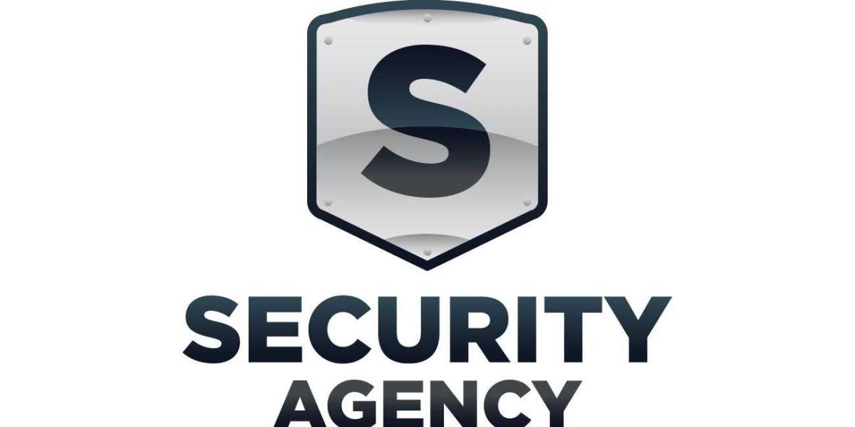
The imagery in a security logo should be chosen carefully. Common elements include shields, locks, keys, and padlocks. These symbols are universally recognized as representing security and protection. Incorporating them into your logo can instantly convey the message of safety and trust.
Tips for Designing an Effective Security Logo
Now that we've explored the fundamental elements of a security logo, let's dive deeper into the design process with some practical tips.
1. Keep it Simple:
Simplicity is key when designing a security logo. A cluttered or overly complex logo can be confusing and fail to make a lasting impression. Remember, the goal is to convey trust and security, so opt for a clean and straightforward design.
2. Emphasize Trustworthiness:
Your security logo should radiate trustworthiness. This can be achieved by incorporating elements like a strong, stable shield or a reliable lock. Make sure these elements are prominently featured in your design.
3. Choose the Right Colors:
As mentioned earlier, colors play a crucial role in logo design. Stick to a color palette that evokes feelings of trust and security. Blue, green, and black are safe choices, but don't be afraid to experiment with shades that resonate with your brand's personality.
4. Test for Scalability:
Your logo will be used across various mediums, from business cards to billboards and websites. Ensure that your logo is scalable and maintains its integrity, clarity, and impact when resized. A great logo should look just as good on a small smartphone screen as it does on a large banner.
5. Be Unique:
While it's essential to incorporate established security symbols, strive for uniqueness. A logo that stands out from the crowd is more likely to leave a lasting impression. Take inspiration from successful security logos but put your own creative twist on it.
6. Seek Professional Help:
Designing a logo is a complex task that requires a deep understanding of design principles. If you're not confident in your design skills, it's worth investing in a professional designer. They can bring your vision to life while ensuring it aligns with your brand's identity.
Real-World Examples of Security Logos
Let's take a look at some real-world examples of security logos that successfully convey trust and reliability.
1. Norton:
Norton's logo features a strong, bold checkmark inside a shield. The checkmark symbolizes safety and verification, while the shield represents protection. The use of dark blue and white instills a sense of trust in the brand.
2. McAfee:
McAfee's logo incorporates a red shield with a stylized letter "M." The red color symbolizes urgency and protection, while the shield reinforces the idea of safety. The sleek and modern design appeals to a tech-savvy audience.
3. ADT:
ADT's logo combines a blue shield with a simplified house shape and a checkmark. This combination suggests home security and reliability. The blue color reinforces the feeling of trust and safety within one's own home.
Conclusion:
Designing a security logo is a delicate art that requires a deep understanding of your brand's values and the emotions you want to evoke in your customers. A well-crafted security logo can go a long way in building trust, which is essential in today's digital landscape. Remember to keep it simple, emphasize trustworthiness, choose the right colors, and seek professional help if needed. By following these guidelines and taking inspiration from successful security logos, you can create a logo that not only represents your brand but also reassures your customers that their security is your top priority.